Dress the Group Chat: A Holiday Card Strategy That Doesn't Require a Uniform

Somewhere between the last slice of pie and the first round of December errands, a group text appears: “So… what are we wearing for the card?” It sounds casual. It is not. The holiday card is no longer just a family update with a nice border. It is a tiny editorial spread, a once-a-year style shoot with higher stakes than most of us admit. And the default solution—everyone in the same pajamas—is the visual equivalent of a shrug.
That’s not to say matching pajamas are evil. They’re comfortable, they’re easy, and they photograph like a catalog page. But in 2026, the holiday card can do better. The goal isn’t to look like you ordered a kit. It’s to look like you belong to the same story without wearing the same costume.
Start with a mood, not a memo
Before anyone picks a color, pick a feeling. Warm and lived-in? Crisp and slightly formal? A little weird in a good way? Write down three words and send them to the group. “Cozy but not sloppy” is more useful than “red and green.” “Neutral with one loud cousin” gives people permission to be themselves. A mood board helps, but a sentence is enough. The point is to set a direction, not a dress code.
Build a palette family, not a team uniform
Color harmony is the quiet workhorse of group photos. You don’t need identical shades; you need shades that get along. Pick a base—cream, oat, charcoal, denim blue—and two accents. Then let each person choose within that range. One person in chocolate brown, another in camel, another in faded brick red can look more intentional than four people in the same exact forest green. It reads as a family of colors, not a corporate retreat.
A simple formula: one neutral, one deep tone, one small pop. If the couch is beige and the tree is green, avoid dressing everyone in beige and green unless you want to disappear into the scenery. Contrast is your friend.
Let texture replace the matching-pajama trick
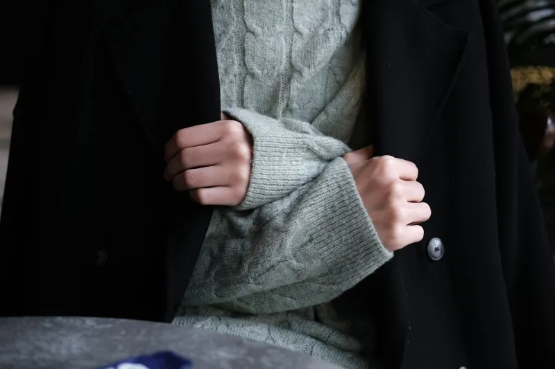
Matching pajamas work because they create instant visual unity. Texture can do the same job with more personality. A chunky knit, a corduroy blazer, a velvet slip dress, a worn denim jacket, a crisp cotton shirt—these materials catch light differently, and that difference is what makes a photo feel rich instead of flat. In a lineup of smooth fabrics, one fuzzy sweater becomes a focal point. In a lineup of textures, everyone gets a little dimension.
This is also where comfort matters. A holiday card is not the time to break in new shoes or a stiff collar. If someone is tugging at a waistband or squinting because the sweater itches, the camera will know. Softness photographs as ease.
Give one person the exclamation point
A group look needs a little tension. Let one person wear the statement piece—a bright red shoe, a plaid blazer, grandma’s brooch, a ridiculous-but-great hat—while everyone else plays support. This is not about making one person the star and everyone else background. It’s about giving the photo an anchor. The eye needs somewhere to land.
Rotate the role if you do multiple setups. The kid who loves sparkle gets the sparkle in the living room shot; the dad who owns exactly one good jacket gets the jacket in the porch shot. Small moves, big difference.
Dress like a band, not a bridal party
A band has a shared aesthetic and individual instruments. That’s the energy you want. Agree on a palette and a level of formality, then let people pick silhouettes they actually like. A midi skirt and a knit vest can sit next to jeans and a blazer if the colors and textures are speaking to each other. The photo should say “these people know each other,” not “these people were assigned seats.”
Work the background before you work the outfits
Take a test photo of the empty couch, porch, or tree. Notice the colors. If the wall is warm yellow, cool grays and blues will pop. If the tree is doing a lot, keep clothing quieter. If you’re shooting outside, check the light at the time you plan to shoot—not an hour earlier. A great outfit in bad light is just a rumor.
Also: raise the phone. Lower angles flatter nobody in a group shot, and a slightly higher camera position helps everyone look natural. Take ten frames. Someone will blink in nine of them.
The kid factor and the reluctant participant
Children are not props, and neither are partners who hate being photographed. Give them choices inside the palette. “Pick one of these three sweaters” works better than “wear this.” Let the kid add a favorite color as an accent. Let the reluctant adult wear the chore coat or henley they already love. A holiday card is a record of actual people, not a casting call for a catalog.
What to skip
Skip logos that date the photo. Skip brand-new stiff clothes that make everyone look uncomfortable. Skip the all-black minimalist look unless your holiday tradition is a very chic funeral. And skip the idea that matching pajamas are the only way to look cohesive. They’re one option, not the standard.
The 2026 card doesn’t need to be perfect. It needs to look intentional. A shared palette, a mix of textures, one good statement, and a background that doesn’t fight the clothes will get you there. The group chat can relax. You’re not building a uniform. You’re styling a small, temporary editorial—and it only has to work for one frame.